CASE STUDY
RealOnes: Centralized platform that fosters community engagement and business growth

Overview of the Project
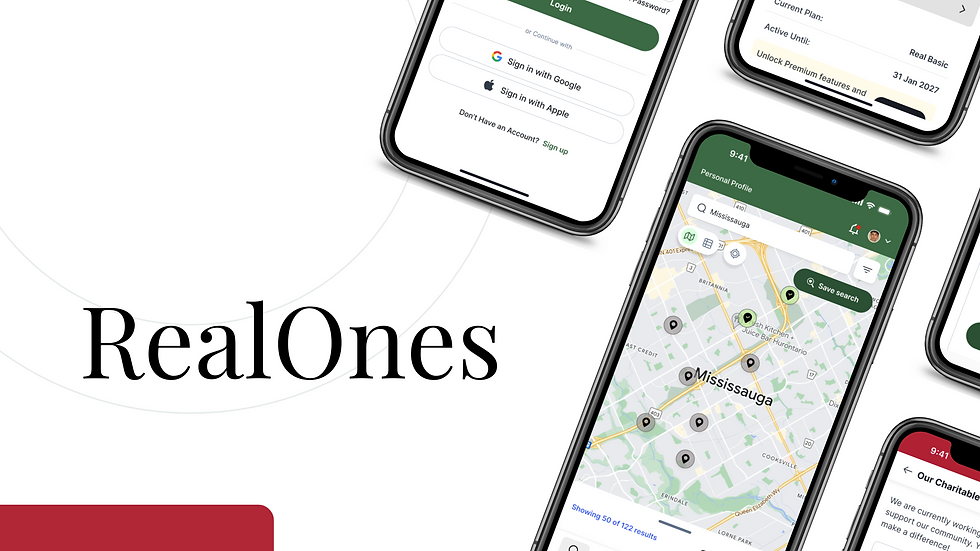
The app is designed as a platform for businesses and community members to engage in various activities such as events, lists, announcements and business profiles.
Business Goal of the App:
The business goal of the app is to create a centralized platform that fosters community engagement and business growth by connecting local businesses with their target audiences. By offering features like event management, public and event lists and announcements, the app helps businesses increase visibility, build customer relationships and drive more engagement through tailored interactions.
User Benefit:
For community members, the app provides a convenient way to discover and engage with local businesses and events. Users can easily save lists, attend events and receive updates or deals through announcements. The platform also offers personalized interactions with businesses, allowing users to subscribe lists, favorite businesses and paricipate in local activities.
My Role
As the sole UX/UI designer on this project,
-
I was responsible for the entire design process from start to finish. This included not only creating wireframes, prototypes, and high-fidelity designs but also ensuring that the user experience aligned with the client's business goals.
-
I handled everything from conducting secondary research to understanding pain points, to building intuitive flows and interfaces that catered to both business and community users.
-
To ensure smooth development, I collaborated closely with the developers, communicating design choices in detail and considering any technical constraints early on.
The Challenges
-
The app had to meet both business goals and community users' needs without overwhelming the interface.
-
Initial wireframes were chaotic, requiring the creation of a cohesive design system for consistency.
-
Designing intuitive navigation for both businesses and community users required careful structuring and testing.
-
Optimizing real-time map views and list switching for performance was a technical challenge.
-
The app had to meet accessibility standards without compromising on design aesthetics.
-
The design needed to accommodate future features like QR codes and in-app purchases, ensuring long-term scalability.
Key Features Included
-
Business Profiles: Businesses can create profiles, add announcements, and share deals.
-
Community Engagement: Users can save lists, events, and interact with business profiles.
-
Event Management: Users can create, share, and attend events.
-
Analytics: Provides businesses with insights into user interaction.

The Design Process
When the client first approached me, they had a clear vision for an app that would serve businesses and community members, helping them engage through events, lists, announcements, and business profiles. But there was a catch—
The wireframes they shared were chaotic and unorganized. Every screen felt disconnected, with different buttons sporting random colors, icons varying in size, and no consistency in font choices. The overall user interface (UI) was clunky, and it was hard to imagine how users would effectively navigate this platform.
It was clear from the start that the app's functionality had a lot of potential, but it needed a major overhaul to make it truly user friendly and cohesive.
Step 1: Tackling the Chaos
The first step was to gain a clear understanding of the current state of the app. I carefully reviewed the wireframes and immediately recognized the key issues:
-
No clear user journey.
-
Inconsistent buttons and fonts across screens.
-
Mismatched icons and other design elements.
With these problems in mind, I set out to create a more structured and intuitive user flow.
Step 2: Building a Logical User Flow
My goal was to organize the app around how both businesses and community members would naturally use it. I mapped out the entire user journey—from signing up, to managing profiles, to interacting with lists and events. This user flow helped identify missing screens and confusing interactions, which allowed me to refine and simplify the overall experience. Once the flow was clear, I knew exactly which screens I needed to create or update.
Step 3: Designing the Missing Pieces
After solidifying the user flow, I started designing the screens that were either missing or needed significant improvement. For example, the event creation process was incomplete and confusing. I added key steps like confirmation, editing, and canceling events, ensuring the layout was intuitive and consistent with the rest of the app.
At this point, I wasn’t just adding screens—I was enhancing the overall experience. Everything needed to feel connected and seamless, from managing profiles to attending events.
Step 4: Cleaning Up the UI
The existing UI was inconsistent and hard to follow, so my next focus was on giving it a cohesive facelift:
-
Color Scheme: I introduced a unified color palette, ensuring that buttons, text, and interactive elements matched across the app. I also differentiated primary and secondary actions, so users wouldn’t have to guess what to do next.
-
Icons: Standardizing icon sizes was another priority. Previously, different-sized icons created visual inconsistency, so I made sure all icons were uniform, helping users focus on content without distractions.
-
Typography: I updated the typography, selecting a single font family with consistent sizes for headings, subheadings, and body text. This made the app look more professional and easier to read.
Step-5: Enhancing the User Experience
With the new screens and updated UI, the user experience significantly improved. Navigation became more intuitive, allowing users to effortlessly manage events and lists. I developed interactive prototypes to test and refine the flow, ensuring a smooth and seamless experience. Businesses now had a clear, structured way to showcase their profiles and announcements, making the app more engaging for both business owners and community members. Overall, the design felt cohesive, user-friendly, and inviting.
Prototype
This design process ensured that both business users and individual community members could effectively interact with the app, addressing their specific needs while keeping the interface intuitive and user-friendly.
"How do I ensure the navigation feels seamless for two distinct user types?"
The solution was in creating clear separation. Both businesses and community members needed dedicated spaces within the app. To achieve this, I introduced distinct sections:
-
My Items: For community members to access their saved lists and events.
-
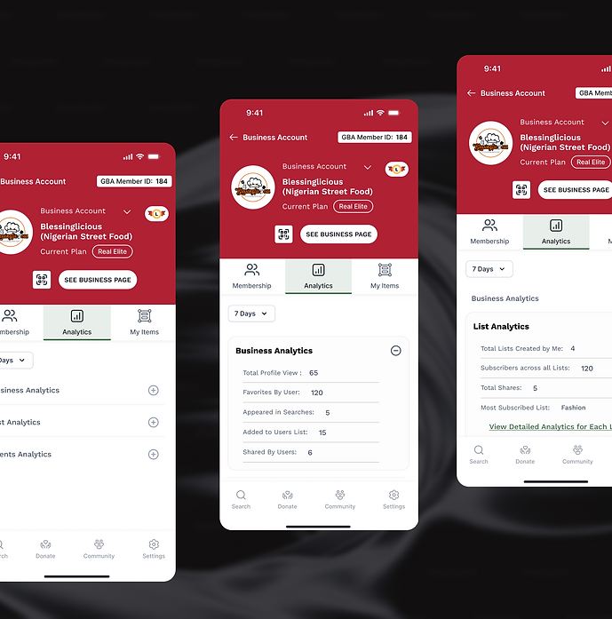
Analytics: For businesses to view performance insights and track engagement.
This categorization made navigation straightforward, ensuring each user type could easily find what they needed without overlap or confusion.
Simplified Navigation with Clear Distinction
"How can I make it obvious whether a business profile is fully set up or still needs work?"
We needed an unmistakable visual cue. I chose to use map icons: a solid pin icon for completed profiles and an outlined location icon for incomplete ones. Additionally, I added a profile completeness meter directly on the business dashboard. Simple, but effective.
Profile Completion Indicators

"Managing events and lists has to be easy, but how can I prevent it from becoming overwhelming?"
Enhanced Event and List Management
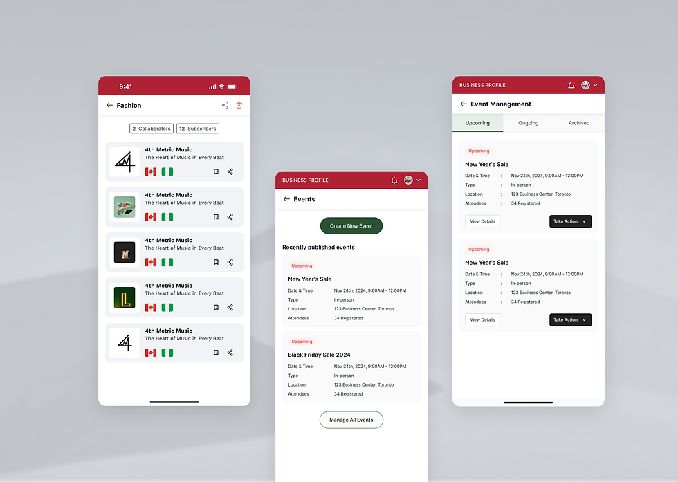
I designed an intuitive layout for the Event Creation screen, allowing users to postpone, cancel, or edit events with just a few taps. For lists, I introduced a My Lists section where users can manage both public and event-specific lists, and receive notifications for interactions. This approach streamlined the interface, keeping everything accessible and organized at their fingertips.

"Why aren’t users upgrading to higher tiers? Maybe the benefits aren’t clear enough."
Clear Upgrade Paths
Maybe the benefits aren’t clear enough." So, I redesigned the upgrade flow, offering tiered options like Real Elite and Real Plus with clearly defined benefits. Each tier's upgrade screen highlighted exactly what it unlocked—such as affiliates, community management tools, or increased visibility—making the decision to upgrade straightforward and appealing.
Solutions That Made a Difference


"What would businesses really want to know about their performance?"
Detailed Analytics Dashboard
The analytics needed to be detailed yet easy to understand. I created a dedicated Analytics tab that broke down user interaction metrics, such as shares, favorites, list subscribers, and event attendees. For lists specifically, I included data on subscribers, shares, and saves, allowing businesses to clearly gauge audience engagement.

Wrapping up this Case Study
Throughout this project, I’ve gained invaluable insights into balancing business needs with a user-centered design approach. The process was both challenging and rewarding, as it allowed me to transform an unorganized idea into a seamless and engaging experience.
The Big Takeaway?
Collaboration and iteration are key.
Looking to the Future
Looking ahead, several exciting features are in development for the next phase.
-
A key addition is the introduction of QR codes, allowing businesses to easily share their profiles, promotions, or events with users. These QR codes will enable quick access to business details and engagement with offers through a simple scan within the app.
-
Another feature in the works is an in-app product purchase option, allowing users to buy products or services directly from businesses on the platform.
The journey is just beginning, and I’m excited to see how these improvements will shape the app's future.


